iTunes Not-So-Bad Design
In response to a post on The Atlantic, “iTunes Really Is That Bad” by Robinson Meyer, I cover an issue I have with one of the given examples supporting the claim of poor design of Apple’s iTunes. The author asks the reader to examine the horizontal navigation bar starting within the music library.
So if you’re in your own iTunes Library, then click on “For You,” you’ll find the entire navigation bar has shifted under your mouse: Your mouse is now hovering over “Playlists,” as the software has inserted forward and back buttons on the far left.
I tried it on my Mac, and the buttons didn’t move. My mouse remained hovering over the “For You” button. As a software developer, I immediatly knew the reason my experience differed: the author’s iTunes window is much narrower than mine. I had to reduce my iTunes width to the mininum in order to duplicate the given example.
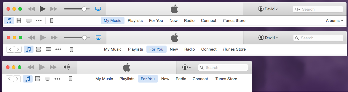
In the image above, we can see in the top two menu bars that “My Music” and “For You” remained lined up at the application width I normally use. The third menu is the mininum width of iTunes which duplicates the author’s observation. I tried repeating the example on another machine and found slight movement in the button positions, but still my mouse remained over the same button.
The author makes good points about why this “messiness” happens, but fails to point out that this observation depends on the application width. Is this a design flaw or a compromise? How many readers not finding this observation on their PC will quickly dismiss the author’s argument? It’s a valid point that iTunes may contain too many features and try to squeeze in too much on the menu bar, but an example that only works in special cases weakens the point.
Meyer suggests “inattention” as the source of “inferior design” decisions by Apple. It seems inattention to detail weakened this post in The Atlantic.
Perhaps iTunes is not as bad as some believe.